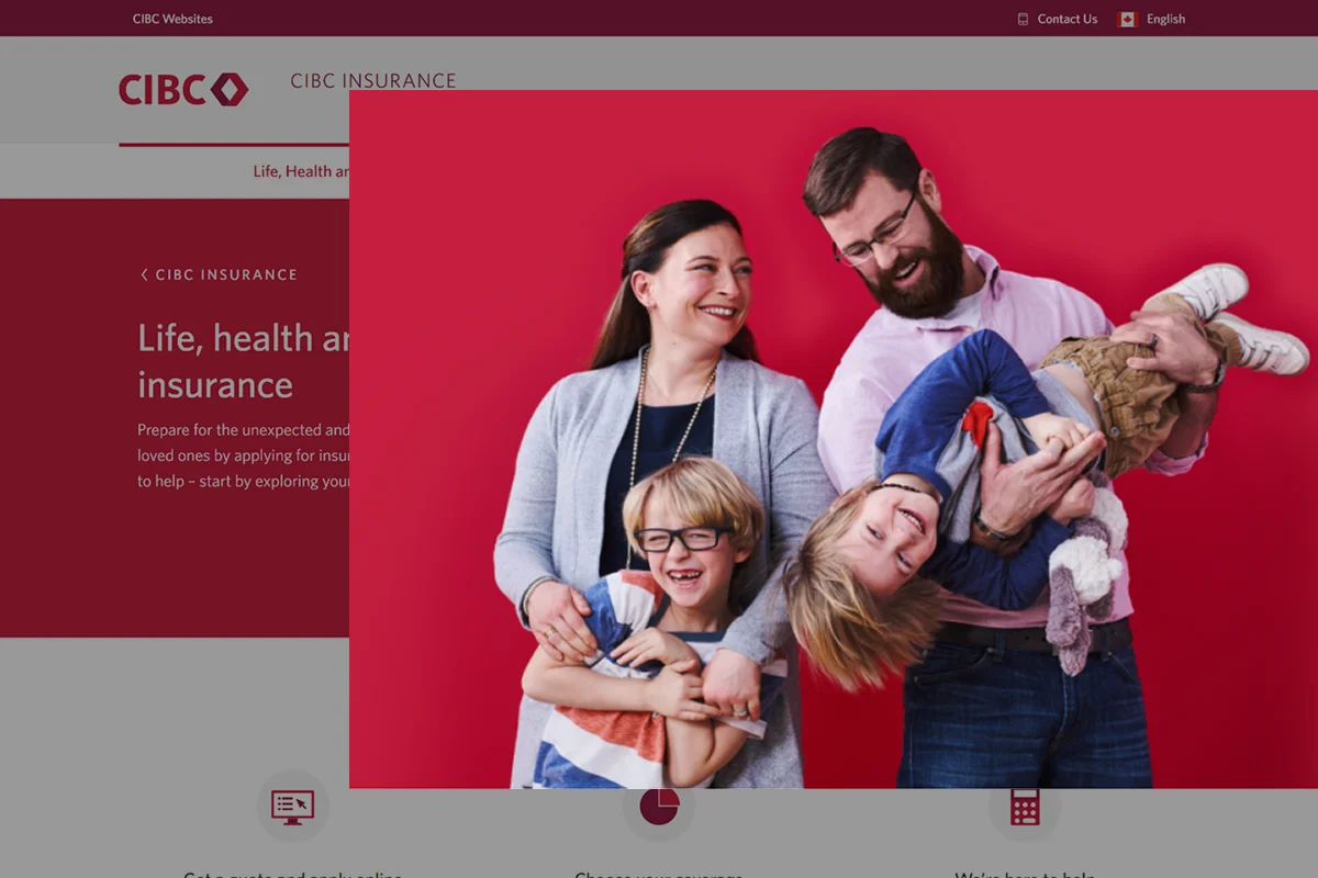
Building the foundation for CIBC Life Insurance's digital experience
Context
CIBC Life Insurance had a vision for where they wanted to go — but no clear path to get there.
My team was brought in as UX consultants to close that gap. The mandate wasn't to ship a redesign, but to:
- Define what good looks like
- Build the strategic foundation
- Demonstrate the art of the possible to executive stakeholders
As UX Lead, I drove the research approach, facilitated stakeholder alignment, and designed the end-to-end conceptual experience.
Private case study
This case study is under NDA
The detailed process, design decisions, and outcomes are available to recruiters and hiring managers.
No password? Request access →
Goal
Establish the design foundation for a competitive D2C life insurance experience: a north star, a research-backed design direction, and early proof that the strategy was working.
At a Glance
Initial problem statement
How might we help CIBC Life Insurance define and deliver a more competitive D2C experience?
The Challenge
Business ambition without experience strategy
The insurance team had a clear vision for growth, but lacked the UX infrastructure needed to execute it. Specifically:
- No shared definition of a best-in-class insurance experience
- No design principles to guide decision-making
- No north-star vision to align stakeholders
- Limited understanding of customer motivations and hesitations
- Heavy reliance on quantitative performance data without understanding the underlying causes
Before improving the experience, we first needed to define what success looked like.
Three constraints that shaped our approach
- No access to existing customers. Due to organizational limitations, we couldn't conduct research with current CIBC insurance customers — forcing us to rethink who we were designing for and how we'd generate insight.
- Three-month timeline. The timeline made it unrealistic to redesign and launch an entire end-to-end journey. We needed a smarter delivery strategy.
- Legal and compliance constraints. Because of compressed timelines, legal review cycles limited how much copy could be changed throughout the funnel.
Revised problem statement
How might we create and validate a future-state experience strategy for CIBC Life Insurance within three months, despite limited customer access and significant delivery constraints?
Approach
Building customer understanding without customer access
Without access to existing customers, I reframed the research population around prospective insurance buyers — the very audience the experience needed to convert. Research included customer interviews, surveys, behavioral analytics, competitive audits, and academic research into insurance purchasing behavior.
Three findings shaped the design direction:
Insurance feels abstract
People couldn't connect coverage to their own lives until they imagined a future scenario where they actually needed it.
Uncertainty kills momentum
Customers abandoned the process when they didn't understand what would happen next or how long it would take.
Personalization signals relevance
People engaged more deeply when recommendations reflected their specific life circumstances rather than a generic offer.
Creating alignment around a north star
I facilitated stakeholder workshops to uncover how business leaders defined a competitive insurance experience. During these sessions, we discovered that teams were already looking to emerging insurtechs as examples of modern insurance experiences. Rather than starting from scratch, we used these references to align on a shared vision and define the principles that would guide future experience decisions.
Three north-star principles emerged:
Insurance feels abstract
Feel relevant earlier
Surface life-stage scenarios and benefit framing before the purchase funnel begins.
Uncertainty kills momentum
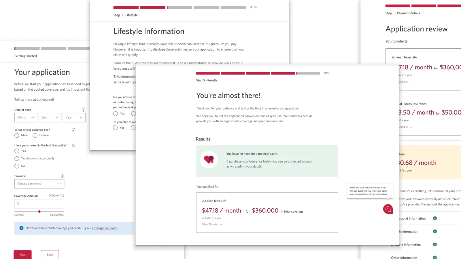
Reduce uncertainty through transparency
Set clear expectations at every step with progress signposting.
Personalization signals relevance
Personalize before commitment
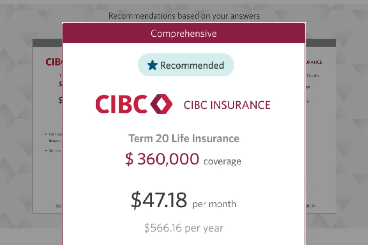
Rebuild the quote experience to surface recommendations based on individual inputs.
Designing for validation, not assumption
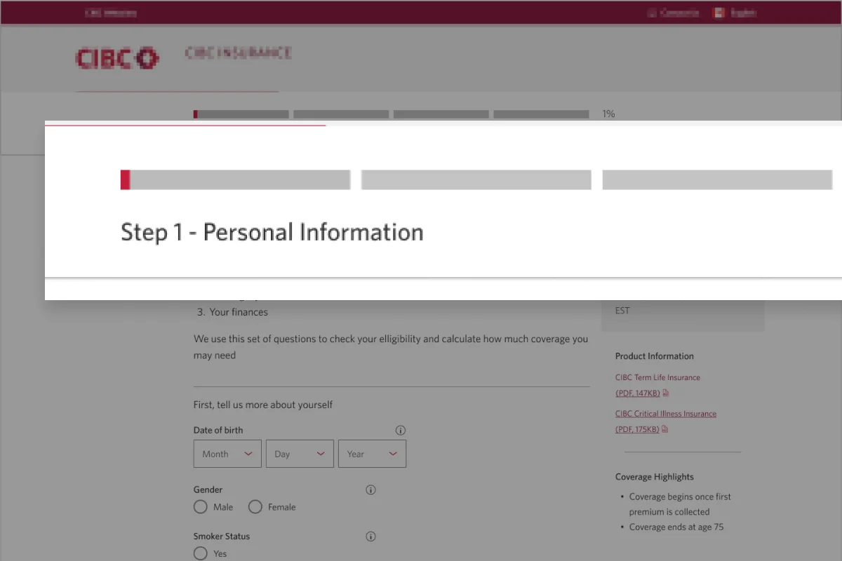
Given the timeline, I designed the complete end-to-end future-state experience but recommended a phased delivery strategy. Rather than launching everything at once, we focused Phase 1 on the landing page and quoting experience.
The goal wasn't simply to ship faster. The goal was to gather evidence that the broader experience strategy was correct before committing to a larger investment.
Landing + Quote Page
Calculated risk and building the foundation for the future
Application + Improvements
Build the rest of the experience
Solution Overview
Phase 1 — Validate the strategy
The landing page and quote experience were redesigned to test three core hypotheses:
Feel relevant earlier
Surface life-stage scenarios and benefit framing before the purchase funnel begins — so insurance feels personal, not abstract.
Element title placeholder
Description of how this design element addresses the principle. You'll replace this with the real content.
Element title placeholder
Description of how this design element addresses the principle. You'll replace this with the real content.
Element title placeholder
Description of how this design element addresses the principle. You'll replace this with the real content.
Reduce uncertainty through transparency
Set clear expectations at every step with progress signposting — so customers always know what comes next.
Element title placeholder
Description of how this design element addresses the principle. You'll replace this with the real content.
Element title placeholder
Description of how this design element addresses the principle. You'll replace this with the real content.
Element title placeholder
Description of how this design element addresses the principle. You'll replace this with the real content.
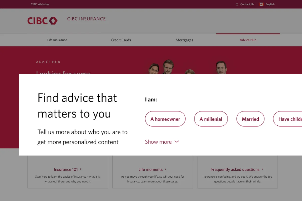
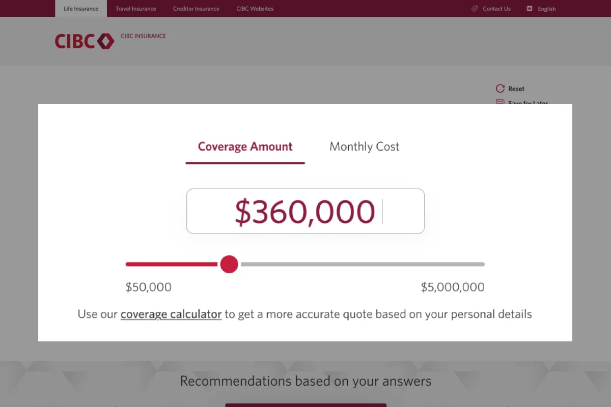
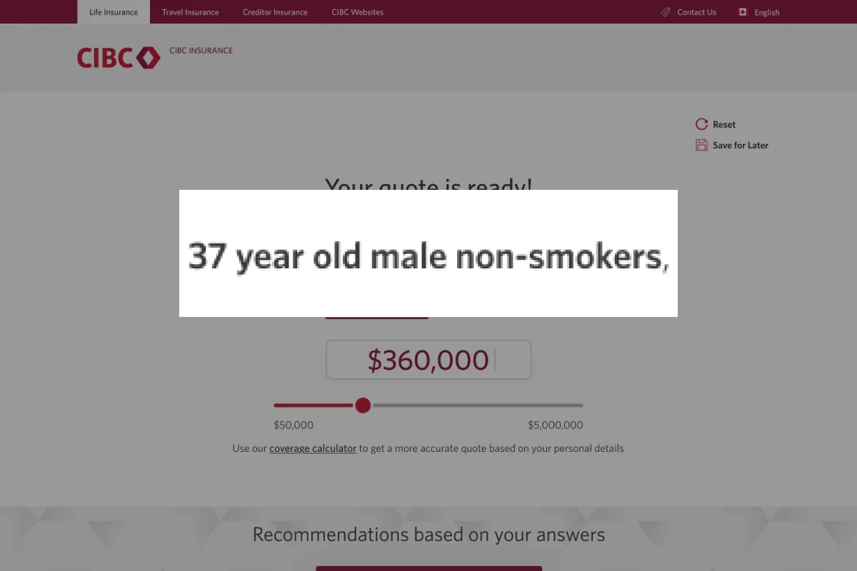
Personalize before commitment
Rebuild the quote experience to surface recommendations based on individual inputs — before asking someone to buy.
Element title placeholder
Description of how this design element addresses the principle. You'll replace this with the real content.
Element title placeholder
Description of how this design element addresses the principle. You'll replace this with the real content.
Element title placeholder
Description of how this design element addresses the principle. You'll replace this with the real content.
Validation
We tested the Phase 1 experience with insurance owners to validate the hypotheses. A benchmark study was followed by a broader quantitative survey — both confirmed the direction:
Participants described the experience as clearer, less overwhelming, and easier to trust — consistent with the three design principles it was built around.
Phase 2 — The future-state experience
In parallel, I designed the full end-to-end north-star experience and presented it to executive stakeholders. The vision received approval and provided the organization with a roadmap for future investment.
End-to-end Application Refresh
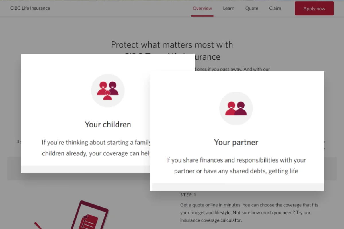
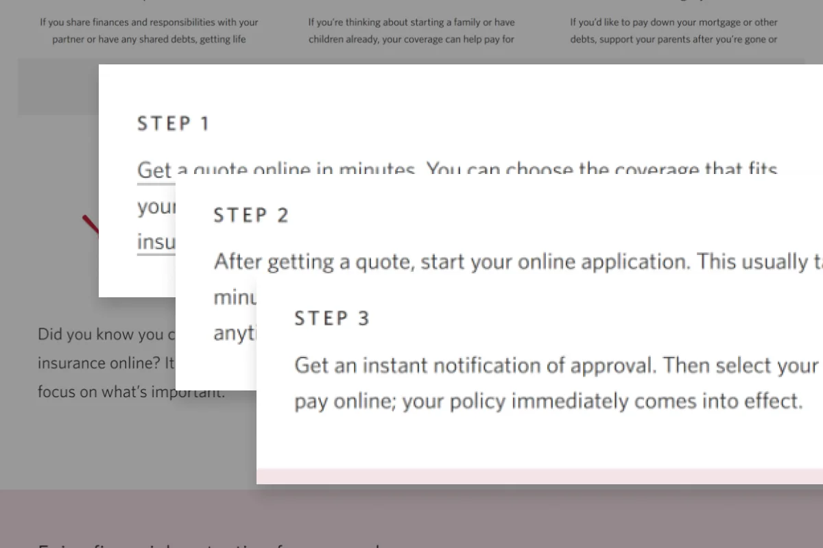
The top-of-funnel refresh set the bar — this vision carries that same quality through the application and payment flows, so customers don't hit a wall of friction after committing to buy.
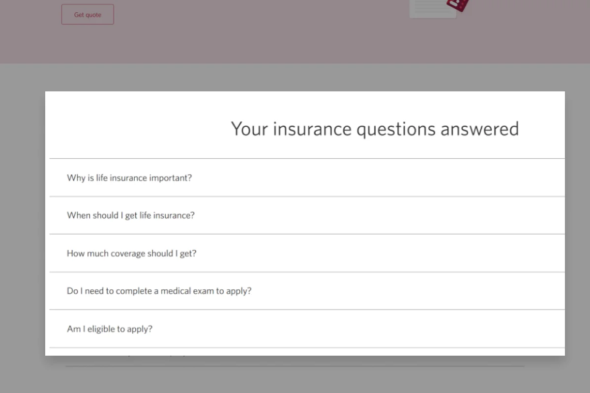
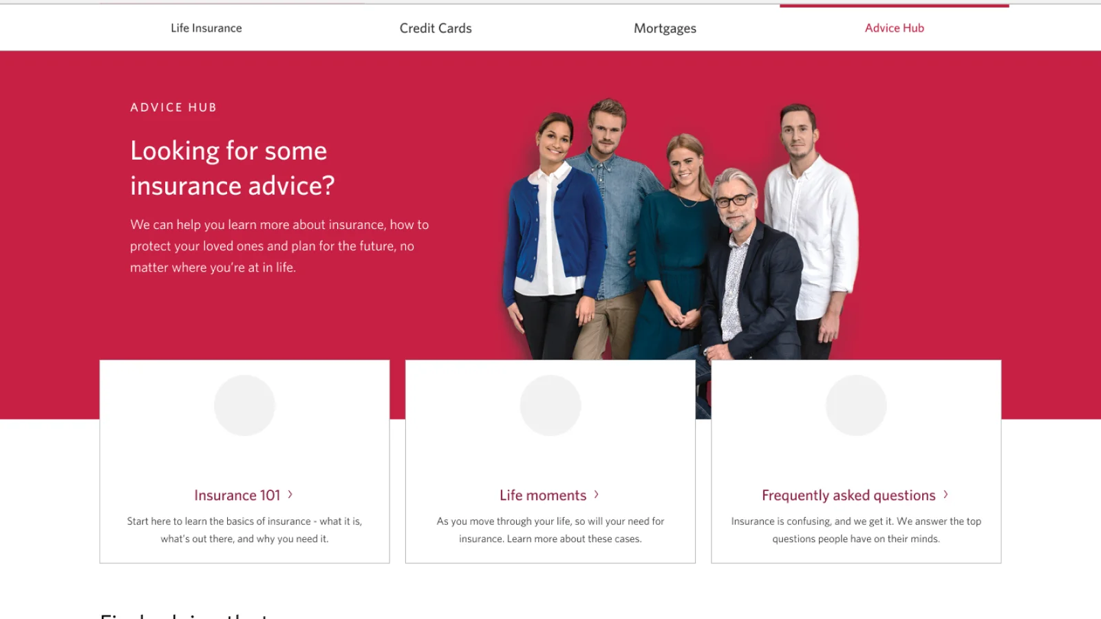
Education Hub
Life insurance decisions stall when people don't feel ready. An education hub keyed to life stages — new mortgage, growing family, first job — gives customers the confidence to engage before they're ready to buy.
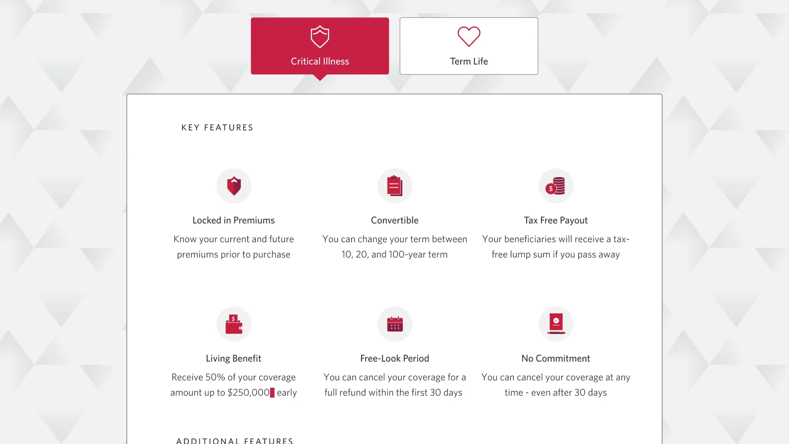
Broader insurance suite
The design improvements proven in life insurance set a template for the broader product suite — applying the same experience principles to critical illness and other coverage types.
Results
Conversion & sales impact
Phase 1 launched with the redesigned landing page and quote experience. Within the first month, the numbers confirmed the strategy was working:
Strategic outcomes
Beyond the launch metrics, the engagement delivered a durable foundation for continued investment:
- Exec-approved north-star prototype with the full end-to-end experience ready for Phase 2
- Research-backed design principles and a repeatable framework for experience decision-making
- $1M in cost savings
- Foundation deliverables: design principles, journey maps, service blueprints, research framework, and workshop templates
The most important outcome wasn't the landing page redesign. It was giving the organization the tools to make better experience decisions long after the engagement ended.
What I'd do differently
I would involve legal and compliance stakeholders in the visioning process from the start. Surfacing content constraints early would have let those requirements inform the strategy, rather than emerge as downstream limitations.
The outcome would likely have been the same — but the path to get there would have been smoother.